news.ycombinator.com
https://news.ycombinator.com/
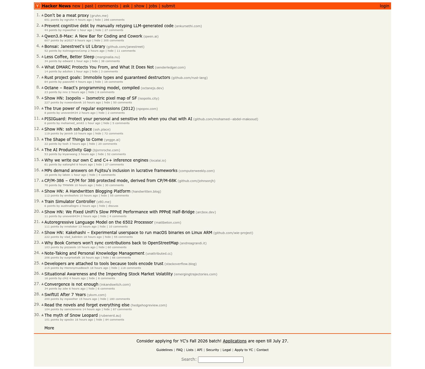

Design & UX
Hacker News features an iconic, ultra-lightweight text-dense design that prioritizes loading speed and content over visual flair. While its extreme minimalism works remarkably well for power users on desktop, the site suffers from severe mobile touch-target issues, tiny metadata text, and lack of responsive padding.
- CriticalSevere Mobile Touch Target Deficiencies
- WarningLow-Contrast Tiny Metadata Text
- InfoFooter and Search Bar Layout Spacing
🔒 3 findings above show what we found — unlock the report for the details and step-by-step fixes.
Marketing & SEO
Hacker News prioritizes functional density and radical minimalism over conventional marketing copy, which perfectly serves its existing developer base. However, for a new visitor, the page provides zero explicit value proposition, lacks headings or meta descriptions, and buries its main business objective (YC batch applications) in tiny footer text. Adding subtle contextual messaging and increasing the visual prominence of YC announcements would significantly improve messaging clarity without alienating core users.
- CriticalComplete absence of an upfront value proposition or headline
- WarningPrimary business conversion CTA is buried in small footer text
- WarningMissing meta description
- WarningNo H1 heading on the page
- WarningIncomplete social sharing (Open Graph) tags
- InfoTitle tag is too short (11 chars)
- InfoNo canonical URL
- InfoNo sitemap found
- InfoNo structured data (JSON-LD)
- Info2 of 2 images missing alt text
🔒 10 findings above show what we found — unlock the report for the details and step-by-step fixes.
Performance
Your performance fundamentals look solid.
Security
No critical security issues, but 2 warnings worth fixing.
🔒 1 finding above shows what we found — unlock the report for the details and step-by-step fixes.
Get the full report for news.ycombinator.com
14 additional detailed findings with step-by-step fixes across design, marketing, performance, and security. One-time payment, yours forever.
Unlock full reportBy purchasing you agree to our Terms and Refund Policy.
Show off your score
Embed this badge on your site or README. It always shows your live score and links back here.
<a href="https://broadscan.io/report/uvic6wD6JSbCGyb0"><img src="https://broadscan.io/badge/uvic6wD6JSbCGyb0" alt="Broadscan score" height="20" /></a>[](https://broadscan.io/report/uvic6wD6JSbCGyb0)